A couple of articles I read this month by Henry Harteveldt and Glenn Haussman discuss hotel website usability. I’d love to read Harteveldt’s Forrester research report, “Using Digital Channels to Calm the Angry Traveler” but the $500 price tag is out of my usability range.
This loyalty traveler notices room size is mentioned on many hotel websites, but too many websites do not present any information on the cost of parking, the prices and menu selection at the hotel restaurant, fitness room and pool hours, or the location and views from different sides of the hotel.
This week I have run into the issue three times where I struggled to match the website room category descriptions with the room I stayed in at the hotel.
Descriptions on the hotel website of room types are often generic, detailed on room amenities, but not specific to any particular room category. In addition, there are sometimes variations with the room type categorization used in the booking process to the room category descriptions used on the hotel website.
The room descriptions and one or two photos do not provide sufficient detail for me to positively identify the web site’s category description to the specific room I stayed in for a night and I have 25+ photos to help me make the correct match.
How is a guest supposed to make a relatively informed decision when spending $200 on a hotel booking for a room that is barely shown and poorly described on the hotel’s own website?
I typically take more photos in the first five minutes in a hotel room than the total photos for the entire property on the hotel’s own website.
Henry Harteveldt of Forrester Research published the blog piece August 5, “Angry Travelers Consider Abandoning the Web”. A graph shows only 34% of leisure travelers feel travel websites clearly present choices and tradeoffs when describing booking options.
2 out of 3 leisure travelers feel travel websites do not adequately present choices.
Glenn Haussman added more detail to Harteveldt’s research with his August 11 piece. Here is an excerpt explaining why the hotel website contributes to the leisure traveler’s focus on price rather than value. Hotel websites do a poor job convincing potential guests there is good value in higher priced rooms and packages.
Glenn Haussman, “Hotel Websites Fail to Meet Consumer Expectations”
HotelInteractive.com http://www.hotelinteractive.com/article.aspx?articleid=14516
One of the problems is that too many hotel branded websites fail to fully explain what comes with a specific rate. The end result is people make decisions based on price and not value. Harteveldt says consumers don’t live in a vacuum. They’re on sites all the time in different industries and they’re downloading applications for their iPhones. In these other arenas they are getting the full taste of customer focused websites and they like it.
The hotel industry, however, is not giving customers valuable information they need to make wise choices.
“One of the big points is the industry is focused on booking. But they have failed to evolve this and ignored the other phases of travel planning such as sharing information about the hotel brand proposition and the destination. They don’t even tell you what a standard or deluxe room means. They leave the consumer thinking about price only and ultimately no one wins,” says Harteveldt, who authored the recent Forrester report “Using Digital Channels To Calm The Angry Traveler.” He also said there should be gas calculators and a method for customers to shop based on their overall budget.
Other information conspicuously missing is basic elements such as room sizes, and the differences between room categories. A consumer may find a more expensive room a better value but without being able to understand the differences they respond by booking on price only.
Hyatt Regency at the Embarcadero, San Francisco
Here is my Loyalty Traveler example of insufficient information for a traveler searching for information on the Hyatt Regency San Francisco hotel website.
The Hyatt Regency San Francisco is a triangle-shaped downtown San Francisco hotel. There are three sides to the hotel with different views and at least three major room types of deluxe bath, balcony, or standard room city view. The hotel website shows 9 different room categories for the hotel.
1. Business Plan no photos and minimal room description. No room size given.
2. Regency Club City View only one photo shows five bed pillows and the top of a dresser. No other photos of this room type.
3. Deluxe Double only one photo showing the beds. My experience as a traveler who has taken thousands of hotel room photos is the bed photo is one of the least informative pictures in helping visualize a room. Unless the bed is an uncommon design, then there is little information in a bed photo for the potential guest. We all know the shape and sizes of the bed. The rest of the room is what matters.
4. Embarcadero Suite only one photo, however this photo makes the point in my statement above. The photo shows the room layout and only a small corner of the bed. This is an informative photo.
5. Deluxe King only one photo with limited useful information.
6. Regency Club Balcony King has only one photo and the difference between this and City View Regency Club is the balcony and the view. The website does not give a clear picture of a balcony or the difference in the views from Regency Club City View room.
7. Guestroom only one photo of what I assume is the primary room category for the hotel and the lowest priced room type. This photo of pillows gives no significant visual information to the potential guest.
8. Balcony Suite only one photo with a partial view of the room interior for what should be one of the highest profit margin room bookings at the hotel. Why isn’t the website selling this room with a dozen suite photos?
9. Balcony King Room only one photo shows partial room view. Can the potential guest even recognize the ocean in this photo?
This photo of the Regency Suite is in a set of photos under the tag “Dining and Entertainment” yet there is no Regency Suite shown in the room types listed above.
There is a virtual tour of room types with a Standard Room description yet there is no Deluxe Room shown in the virtual tour when this is two of the room types shown in the category descriptions.
Is a Deluxe room a standard room? Is “Guestroom” the same as a “Standard Room”?
A search for room rates on the hotel website shows “Bay View King”.
Which room category above matches Bay View King?
My guess was #7 Guestroom, but this is another example of the poor usability in matching room type wording used on the booking engine to the room category list on the hotel website. Reading the hotel room description it was described as a “Balcony King” room.
Looking at the Hyatt Regency San Francisco hotel factsheet, the rooms are described this way:
802 guestrooms, including 45 suites / parlors, 513 kings / queens, 245 double /
doubles, 104 Hyatt Business Plan®, 176 Hyatt Gold Passport®, 21 accessible rooms,
144 with balconies / patios, and 670 non-smoking rooms.
Another room category not previously mentioned is described as “176 Hyatt Gold Passport” rooms. I assume these are the Regency Club room types but I have no direct evidence from the website to support that correlation.
Loyalty Traveler Hyatt Regency San Francisco Photos
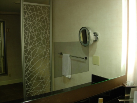
The Regency Club City View room is described as having a “lavish granite bathroom with built-in TV”. What does that mean to you? A picture of the built-in TV would probably have a significant effect on bookings for this room type.
Have you been in a bathroom with this kind of TV before? Unfortunately I didn’t take a photo with the TV turned on.
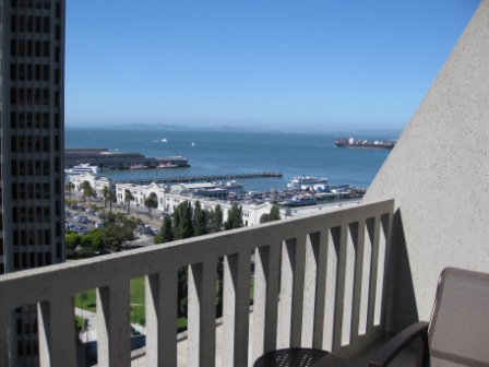
The Balcony Rooms are primarily located on the Sacramento Alley north side of the hotel. Here is a balcony view of the Embarcadero Center and San Francisco Bay.
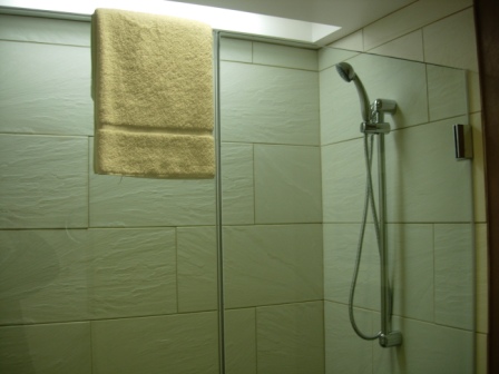
Some rooms were remodeled in 2008 with no bathtub and a glass shower stall. The website does not clearly identify which room types have this style of bathroom.
Balcony Suite rooms are longer balconies shown here on the east facing side of the hotel and a similar set are located on the west facing side of the Hyatt Regency.
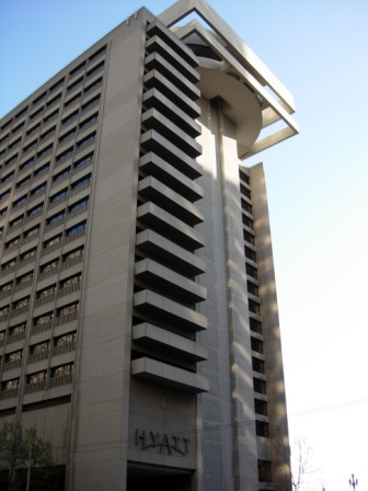
The Market Street side of the Hyatt Regency San Francisco hotel has some great views of the San Francisco Bay Bridge.
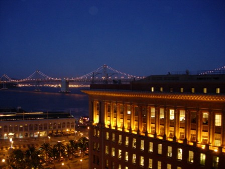
Here is a sample city view room from the Drumm Street front entrance side of the hotel.
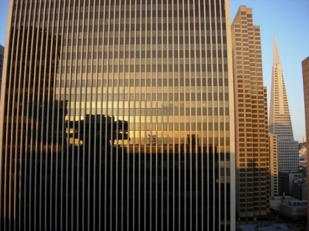
The Hyatt Regency San Francisco has one of the best locations in San Francisco and some aspects of the hotel rank it as a premier choice for a San Francisco hotel stay. The Hyatt Regency hotel’s website does an inadequate job of selling the many features of this iconic San Francisco Embarcadero waterfront hotel.


3 Comments
Comments are closed.